TYPOGRAPHY & CHILDREN'S PRODUCTS
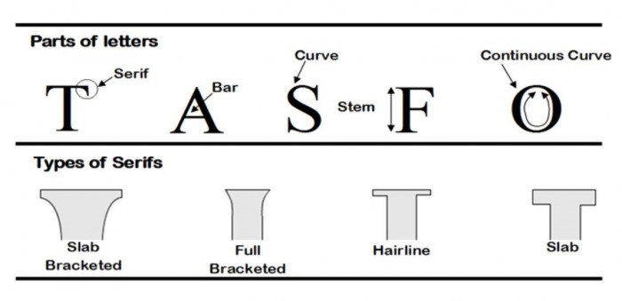
You must be able to recognise the main styles of typography, and be able to label the main parts of letters.
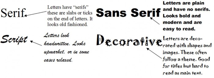
The four main styles of typography are:
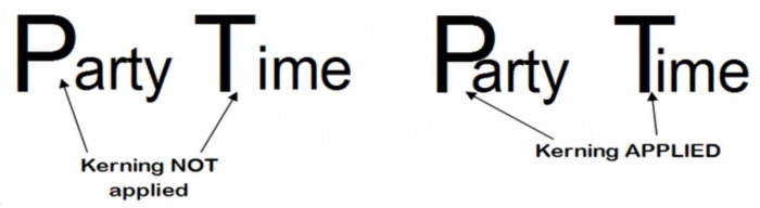
KERNING
The spacing between letters can make typography more visually appealing and easier to read.
This letter spacing is called Kerning.
It is often used to move individual letters closer than usual, so that they ‘overhang’ each other.
For Example:
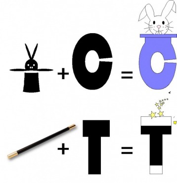
Party Themed Decorative Typography
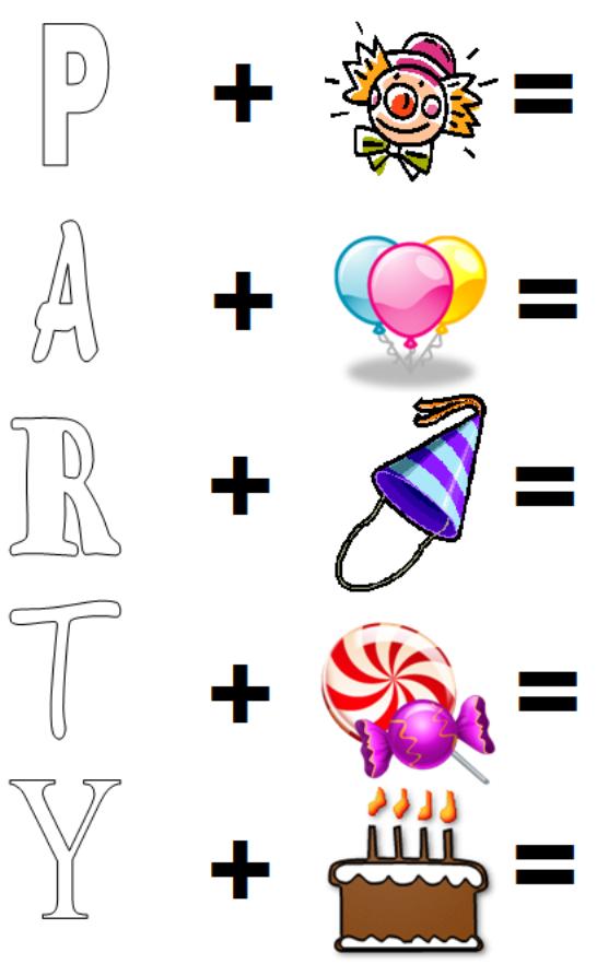
The easiest way to design party themed typography is to take a simple letter, and combine It with a simple image, like the ones you practised drawing earlier.
For Example
TASK
Complete your own decorative typography designs using the lettering outline and images given below.
TASK: Typography Analysis
A big supermarket has asked a graphic design company to design the writing style for the packaging of a new line of party packs for children’s parties.
TASK: Complete the following evaluation work. These types of questions are very common on exam papers. Use ACCESS FM to help if you’re stuck!
The style of writing below has been printed on prototype packaging for a party pack. It has been rejected by the supermarket.

1. Study this style of lettering. Give an explanation why you think that the supermarket rejected the design.
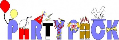
The graphic design company developed their original idea. When they showed it to the supermarket it was accepted to be used on the packaging.
2. Study the style of lettering above. Give an explanation why you think that the supermarket accepted the new design.
